lipidr supports two types of plots for sample quality checking.tic plots a bar chart for total sample intensity.boxplot plots a boxplot chart to examine the distribution of values
per sample.
plot_samples(
  data,
  type = c("tic", "boxplot"),
  measure = "Area",
  log = TRUE,
  color = NULL
)
Arguments
- data
LipidomicsExperiment object.
- type
plot type, either
ticorboxplot. Default istic.- measure
Which measure to use as intensity, usually Area, Area Normalized or Height. Default is
Area- log
Whether values should be log2 transformed. Default is
TRUE- color
The column name of a sample annotation to be used as color
Value
A ggplot object.
Examples
data(data_normalized)
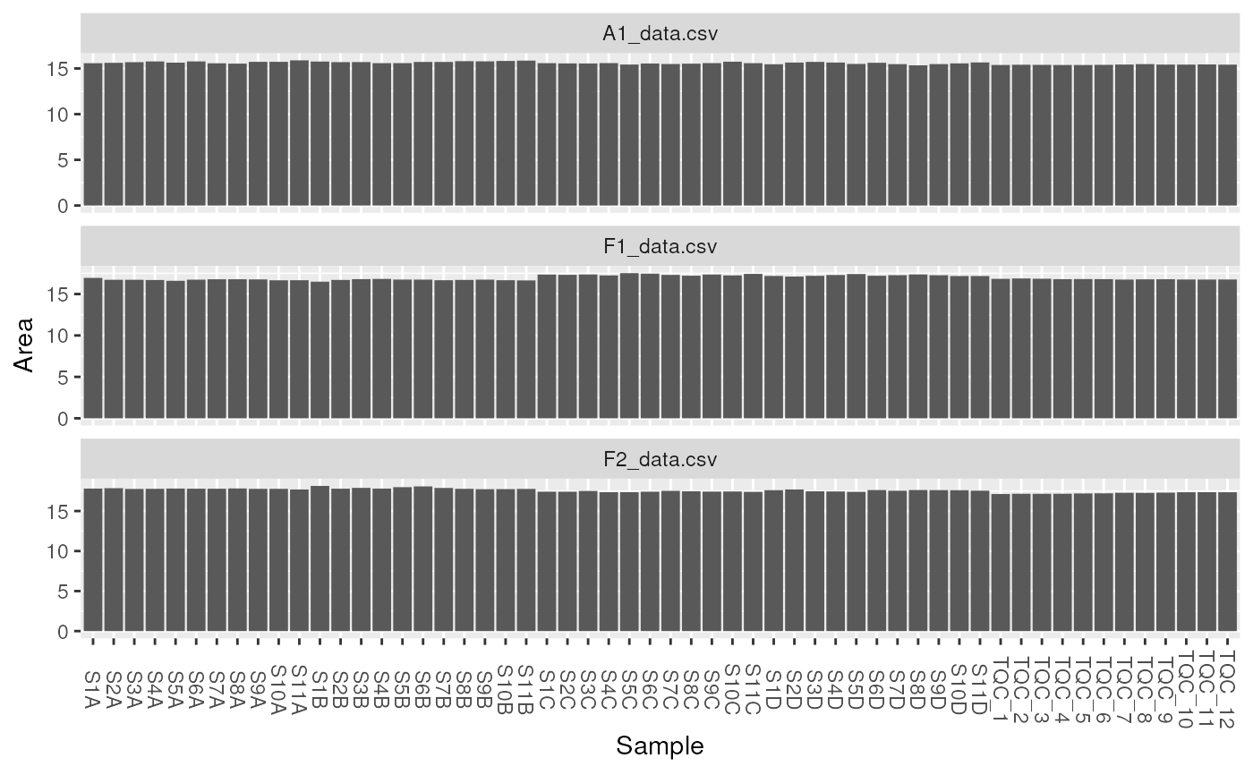
plot_samples(data_normalized, type = "tic", "Area", log = TRUE)
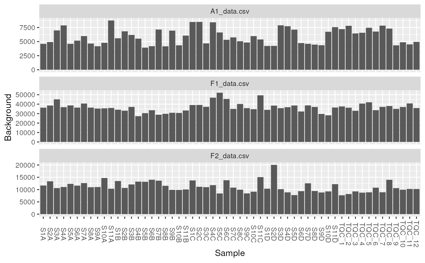
 plot_samples(data_normalized, type = "tic", "Background", log = FALSE)
#> Warning: Removed 1 rows containing non-finite values (`stat_summary()`).
plot_samples(data_normalized, type = "tic", "Background", log = FALSE)
#> Warning: Removed 1 rows containing non-finite values (`stat_summary()`).
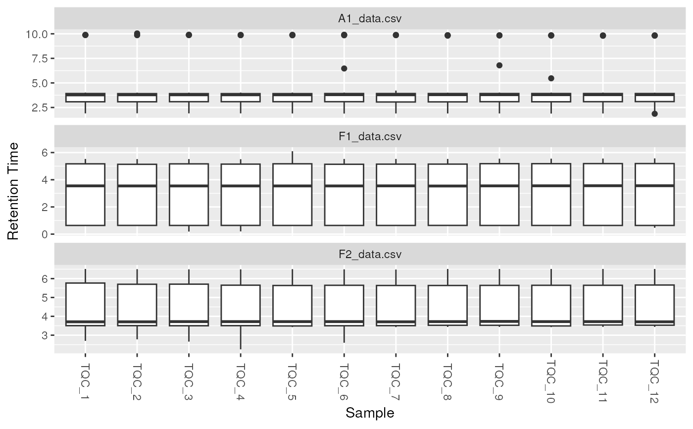
 plot_samples(
data_normalized[, data_normalized$group == "QC"],
type = "boxplot",
measure = "Retention Time", log = FALSE
)
#> Warning: Removed 1 rows containing non-finite values (`stat_boxplot()`).
plot_samples(
data_normalized[, data_normalized$group == "QC"],
type = "boxplot",
measure = "Retention Time", log = FALSE
)
#> Warning: Removed 1 rows containing non-finite values (`stat_boxplot()`).